SentriKey Real Estate Redesign
Our primary objective was to overhaul and streamline the navigation, simplifying access to the features in both applications while gradually migrating pages from PHP to Angular. Our solution involved streamlining categorization, incorporating icon-based navigation items, implementing a spacious and clearly delineated left-aligned navigation structure, and adhering to a concise design system. Furthermore, our forward-thinking approach ensures scalability to accommodate future feature expansions, and the effectiveness of our design has been rigorously validated through usability testing and user feedback.


Background
The main application works with a smart lockbox device to give real estate agents control over who has access to their devices. The user has access to endless data regarding key management for their devices such as who accessed the property, what times did they access the property, how long were they there, and also gives their brokers and MLS control over all of the real estate agents under them. The company also has an additional application that shares some of the same pages. There was a need for a competitor in the appointment scheduling market for real estate agents and SentriLock saw an opportunity. The core application interfaces with a smart lockbox system, granting real estate agents control over access to their properties. This application provides users with comprehensive data related to key management, including access history, entry timestamps, duration of visits, and centralized control for brokers and MLS organizations over their affiliated agents. Recognizing an opportunity in the real estate appointment scheduling market, SentriLock expanded its services and created a supplementary application that shares certain pages.


Challenge
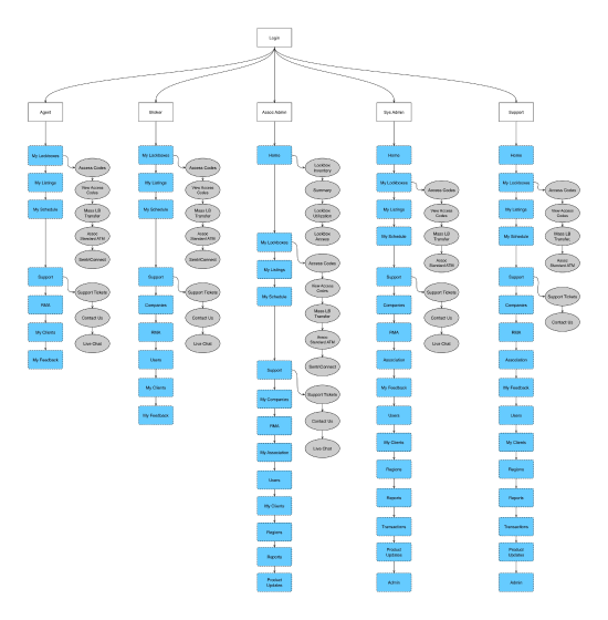
The primary challenge stemmed from user confusion experienced by individuals with access to both the principal real estate application and the scheduling software. Both applications shared a common navigation structure, with specific links hidden based on user permissions. User feedback consistently highlighted issues related to discerning the active application due to the similarity in naming conventions between the two. Furthermore, the original application, developed nearly two decades ago, was devoid of user-centric considerations. Feature prioritization had historically favored sales team objectives over usability, resulting in a legacy system that lacked user-centricity.


Goal
A major initiative was undertaken to modernize our technology stack and embark on a gradual transition from PHP to Angular. The primary goal was to retain the core functionality while refreshing the user interface to meet contemporary standards. This transition also presented a strategic opportunity to revamp the navigation system, which had been a persistent source of confusion for users with subscriptions to both applications. The central objective was to streamline navigation and align the application with our newly developed design system.
User Research
Our user research process began by referencing the user personas we had meticulously developed. These personas provided valuable insights into the diverse needs and expectations of our user base. To gather real-world insights, we collaborated with our customer support team, who shared the challenges and pain points reported by our users. To further validate these findings, we engaged our customer advisory group through a comprehensive poll. The feedback from this group reinforced the prevailing confusion surrounding our navigation. In summary, our research efforts, guided by user personas and substantiated by customer support insights and feedback from our advisory group, collectively underscored the necessity for a more intuitive and user-friendly navigation system. Armed with these insights, we embarked on redesigning our navigation to align with our users' needs and expectations.
Wireframes
Our most significant challenge revolved around simplifying the navigation to cater to both applications effectively. The process involved four iterative cycles, occasional feature deprecation, substantial communication hurdles, numerous meetings, and extensive input from stakeholders. The outcome was a navigation system featuring buttons with descriptive labels and sizable icons, all left-aligned to present a clear, visually prominent, and minimalistic navigation menu. This overhaul was executed with adherence to a recently established design system, ensuring a cohesive and synchronized user experience across both applications.


User Testing
The initial phase of user testing focused on evaluating various groupings of sub-navigation menu items with the aim of minimizing categories. Participants were presented with scenarios, and their navigation preferences were probed to ascertain the optimal arrangement. Subsequent testing introduced a choice between a traditional top-horizontal navigation and a left-aligned vertical navigation system enriched with icons. The feedback from all three users consistently favored the vertical navigation with icons. This preference was attributed to its clarity, conciseness, and alignment with industry conventions, fostering a user experience that was both intuitive and familiar.
